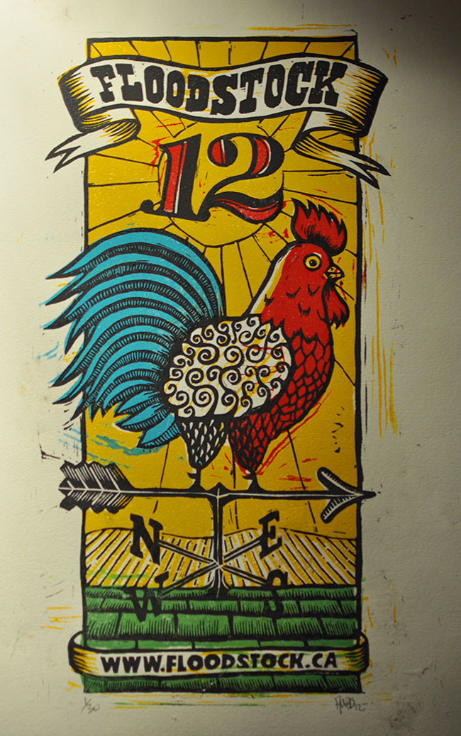
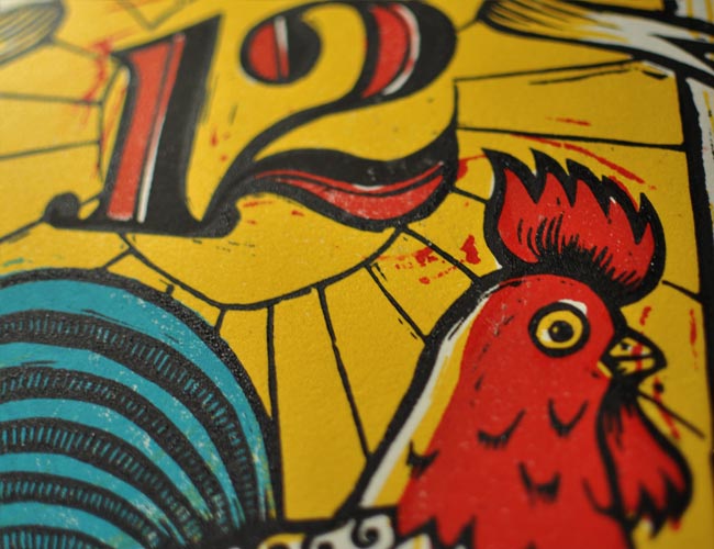
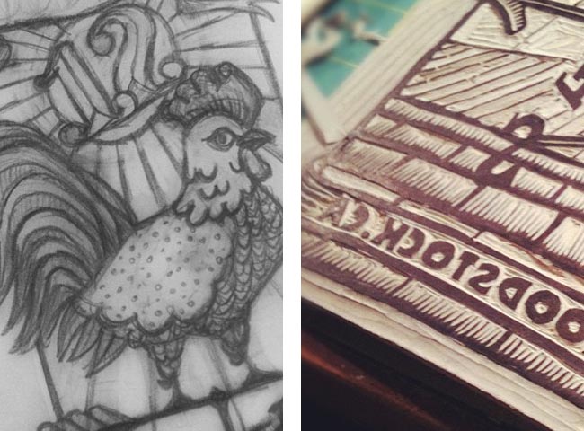
This year’s Floodstock poster direction was simple: a rooster. Nothing more to it. The sketches came together well and I started to envision how the colours could work. This five-colour poster was actually printed on three plates. In favour of limiting the number of plates to be carved, I combined the red, blue and green colours on the same plate, adjusting the design to accommodate this approach.
I’ve always taken a fairly haphazard approach to my printing process; I don’t mind slight mis-registration, mottled ink coverage or the odd fingerprint — and since I’m impatient to see the final result, I tend to rush. But my typical approach coupled with a few other factors caused me some frustration on this project. I experimented with a new type of ink: Caligo Safe Wash Relief Ink. It’s an oil-based ink, but it cleans up with water. I like the idea of limiting the amount of Varsol I use for clean up and thought I’d give it a try. Unfortunately, I mis-ordered and had to use my Daniel Smith oil-based inks as well (and to be clear, I don’t think either brand of ink is inferior…they just didn’t seem to print well together for me).
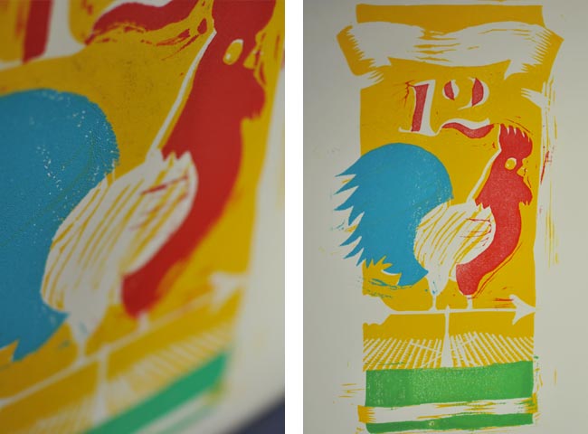
I believe it was the combination several factors that caused me difficulty in getting a good impression: different inks, slightly warped linoleum plates, being in a bit of a rush to finish the posters before the event and a cottage vacation, and possibly the humidity in my basement studio. Lots of wasted prints on this one but the results for the final prints were decent. Certainly some lessons learned for next time!