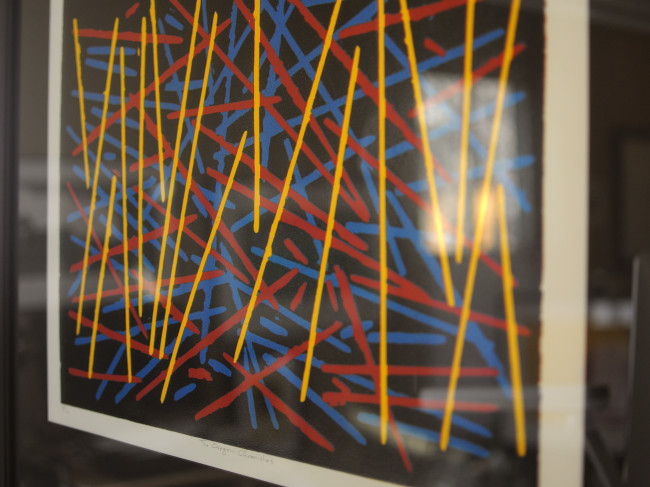
My Family
I was encouraged to get back to doing some printmaking by my Mother-in-law (thanks Emi!)…and my family were the perfect subjects. I used some of my favourite photos of them from over the years as reference with the thought of creating a triptych. The teal and pink provide a nice pop of colour.


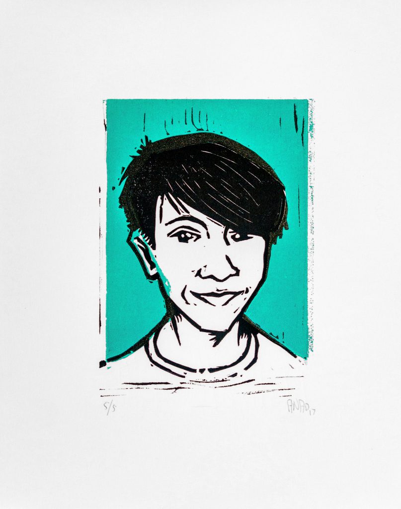
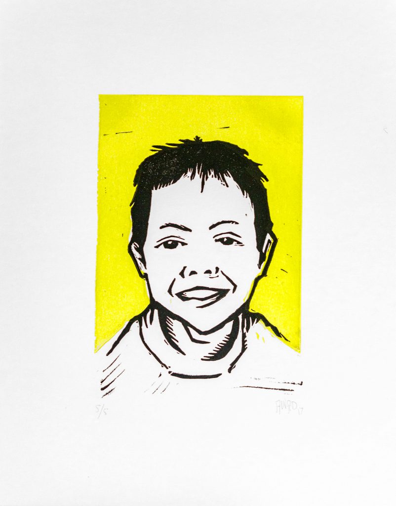
Four Brothers
I was was honoured to be commissioned to create portraits of these four brothers. I love making linocut portraits. Distilling someone’s facial features down to relatively few lines is a challenge, but it’s also fairly straightforward.

I’ve refined my approach over the years: I use photographic reference and quick pencil sketches to start and then good ol’ Photoshop to tweak the size and position of features (it’s amazing how a very slight change to the eyes’ size, angle and distance apart affects the likeness). Once I’m happy with the likeness, I retrace with ink to give it a loose feel, then transfer the image to the block and start carving.


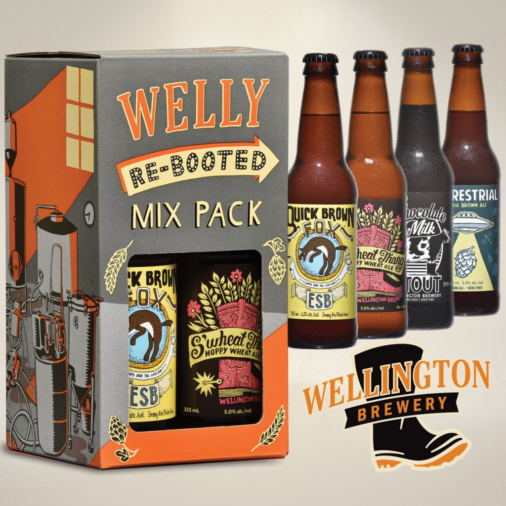
Welly Re-booted Mix Pack
Wellington Brewery has revived a few of their “Welly One-offs” in a new mix pack and I’m absolutely chuffed to see S’Wheat Thang included. Pick it up at the LCBO or Beer Store!
Clive Lewis’s Studio
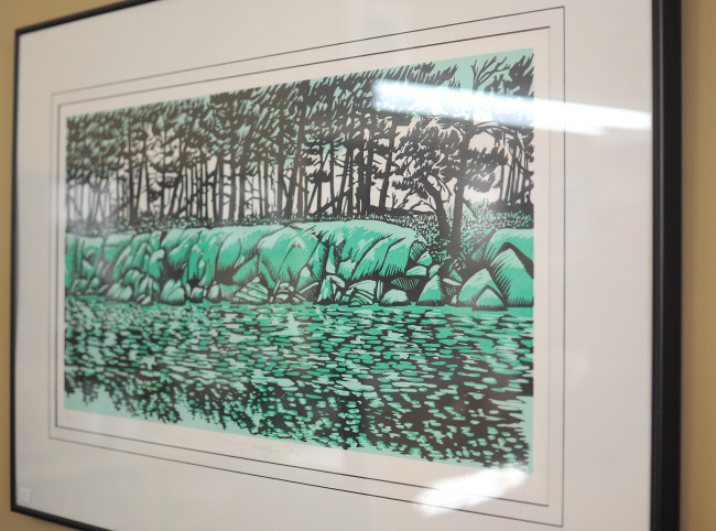
This past Christmas (as always), Tara got me a really thoughtful gift. A yet-to-be-chosen print by local Guelph printmaker Clive Lewis!
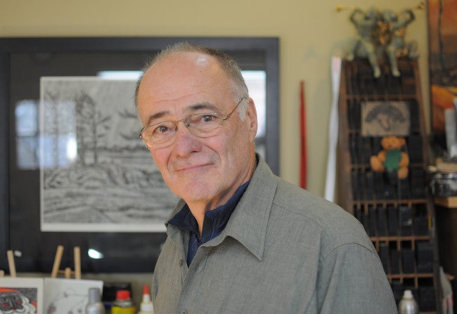
And on top of that, knowing how much I enjoy learning how other artists work, she reached out to Clive and arranged a studio tour! We were introduced to his work by way of the fun Art on the Street festival a few years back and have been fans of his stark landscapes and bold abstract prints ever since.
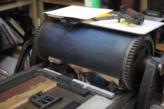
Clive was very welcoming and happily showed me around his home-based studio as I peppered him with questions. He has a Vandercook No. 2 proofing press which was typically used for proofing type and woodblock illustrations and as such, ideal for block printing. Clive uses the old letterpress method of wooden “furniture” and metal quoins to lock up the engraved blocks into position on the press. I was curious about his pin registration system and he gave me a quick demonstration; I was vaguely aware of this technique but had never seen it in action. The combination of tightly locked up blocks and the registration system allows for precise alignment of multi-colour prints.
In order to produce large engravings, Clive uses a vinyl material more commonly used in flooring. It requires more preparation (sanding and mounting) but he demonstrated how it holds fine details much better than the so-called “artist-grade” materials. Along with offering helpful tips on sharpening my carving tools, I was also pleased to discover he uses Stonehenge paper for his prints (my preferred choice too).
I’m excited to choose a print from his collection to adorn our (ever-shrinking) wall-space at home. I may just have to put it up in my studio instead! You can have a look at the full set of photos from my tour over on Flickr.
Welly Coaster Series
I had the fantastic chance to work on Wellington Brewery’s second “Welly Coaster Series” with a few other local artists: Ryan Price, Gordon James Lachlan Auld and Cai Sepulis.
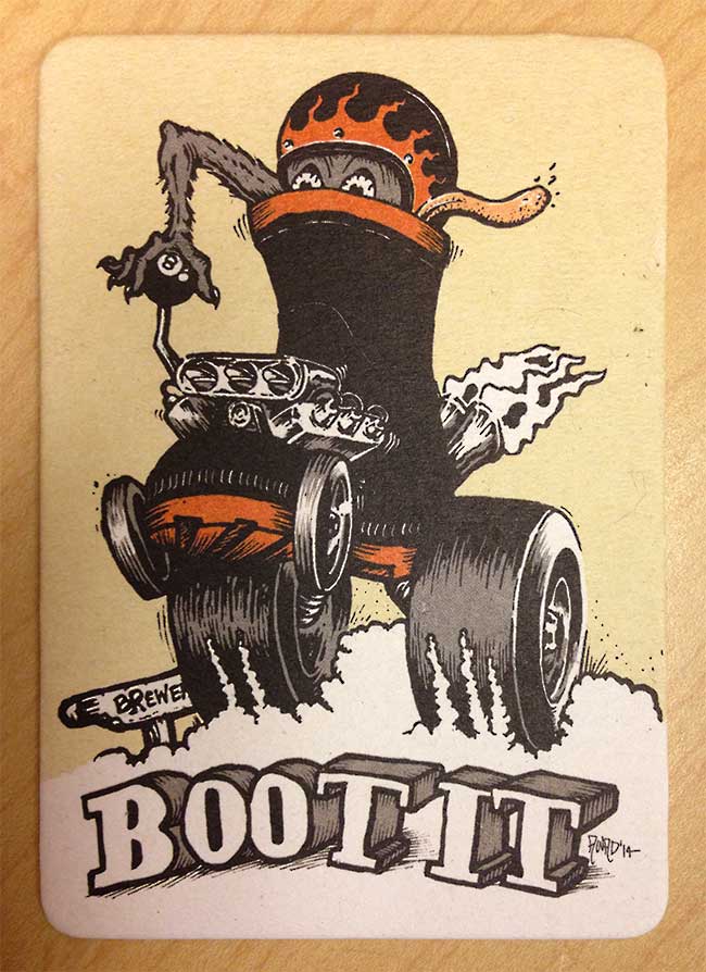
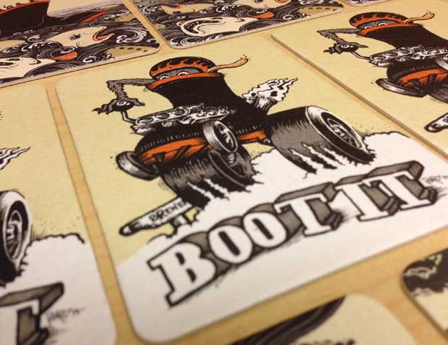
The criteria were very simple: incorporate the Wellington boot and the brand’s colours. I decided to do an homage to Ed “Big Daddy” Roth’s hotrod illustration style. It was a really fun project and kudos (again) to Wellington for involving the local arts community. Look for the coasters at your local watering hole soon!
Learning Drypoint
The immensely talented artist and printmaker, Ryan Price generously invited me to visit his studio and learn a bit about how to create a drypoint print.
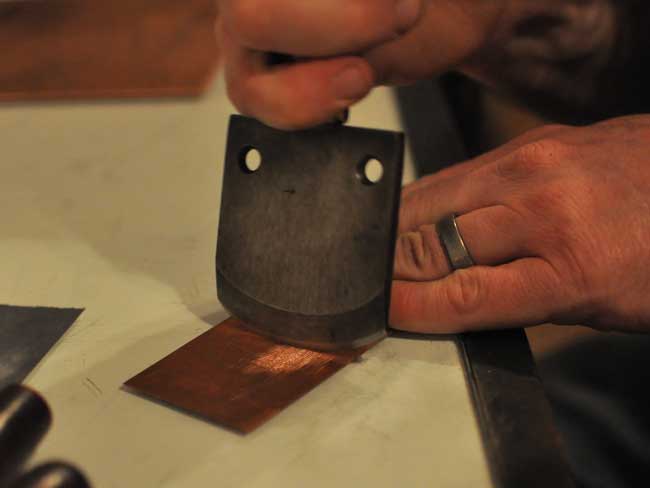
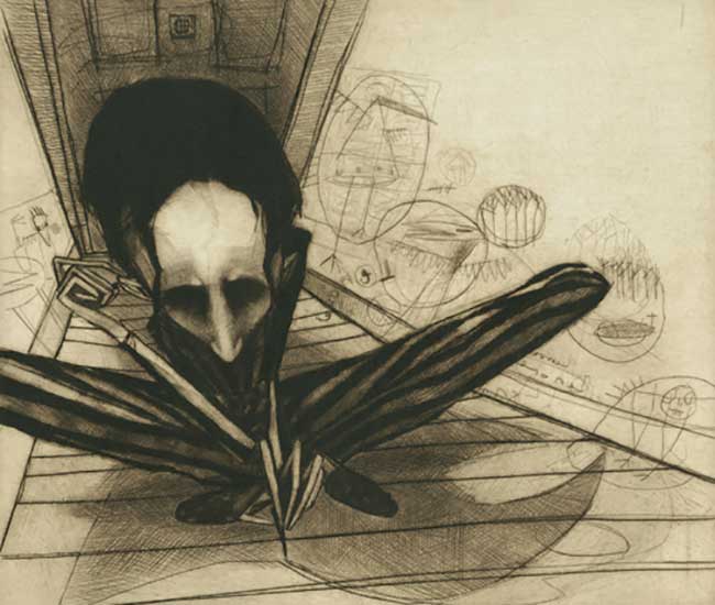
Drypoint is an intaglio printmaking method which means the image is incised into a metal plate (usually copper). With drypoint in particular, ink is held in the burr that is thrown up at the edge of the incised line in addition to the depression that is formed. It can be a very “sketchy” printmaking technique but rich blacks and lush tonal gradations can be achieved as well.
Getting Started
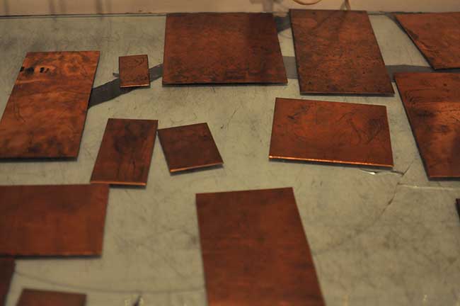
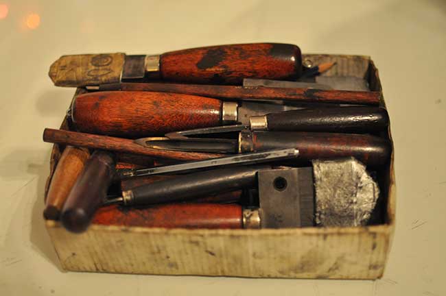
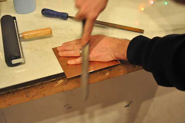
Ryan started by showing me the tools that are used and the kind of marks they make on the plate (scribes, burnishers and mezzotint rockers amongst others). We then prepared the plate. One of the things I really like about printmaking is the technical aspect of it; making sure all of the factors that contribute to a decent impression are properly attended to. Preparing the plate consists of filing the edges so as to not damage the press roller or paper as a print is made.
Making Marks
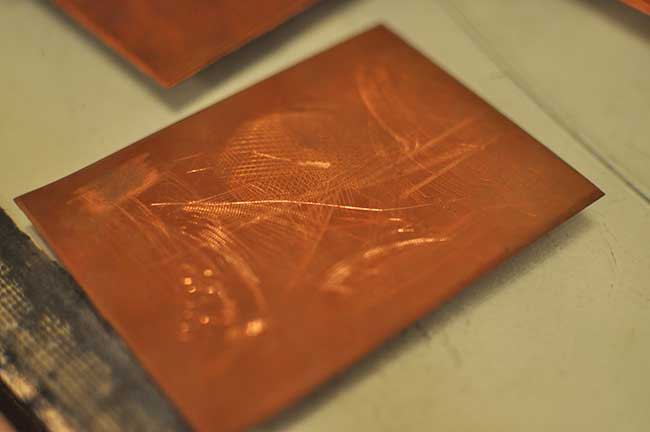
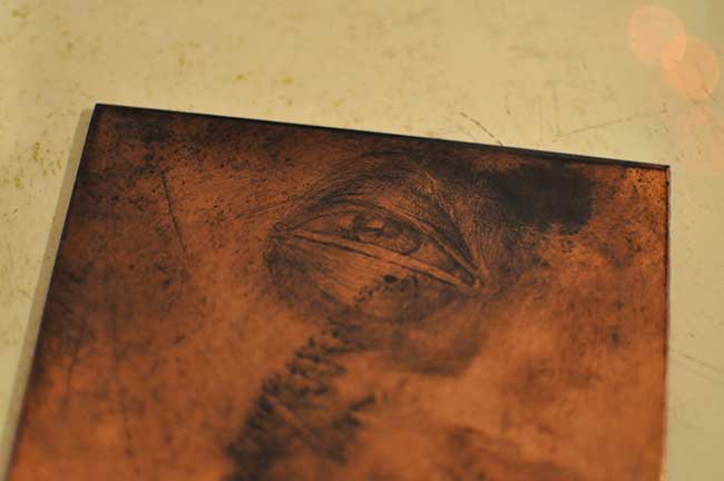
With that done, we began making marks on the plate. I found drypoint to give very immediate results. It’s easy to see the image developing on the plate (under suitable lighting conditions) and it becomes even more obvious once a bit of printing ink is smudged on to it (another aspect of printmaking that I like: getting my hands dirty!).
Printing
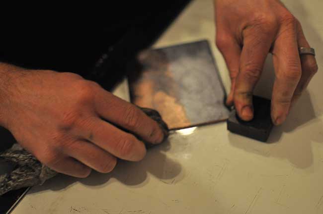
After I was satisfied with my image, we moved on to printing. Inking the plates involves covering the plate with ink to make sure it seeps into every groove and wiping the surface to remove most of the ink using Tarlatan, a very stiff cheese cloth material. This creates the gorgeous soft grey background and rich image intaglio printing is known for.
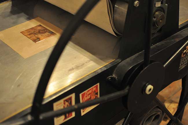
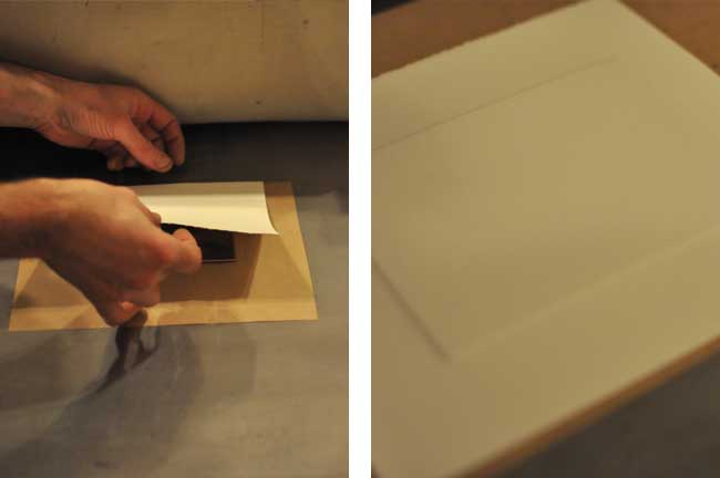
High quality paper is a very important factor in this type of printmaking method — even for artist’s proofs (we used BFK Rives). The paper is soaked in water and patted dry to remove any surface moisture, then placed on the inked plate and run through the press. An etching press is required for this as the pressure required for a good impression is quite high. Ryan has a large (and incredibly heavy) Praga press but more affordable tabletop etching presses will also do the job.
The Proof
Seeing my first printed drypoint was a real treat. I love the quality of the impression and how it differed from my expectation. I’m not totally in love with the composition but it was just to get a feel for the technique anyway.

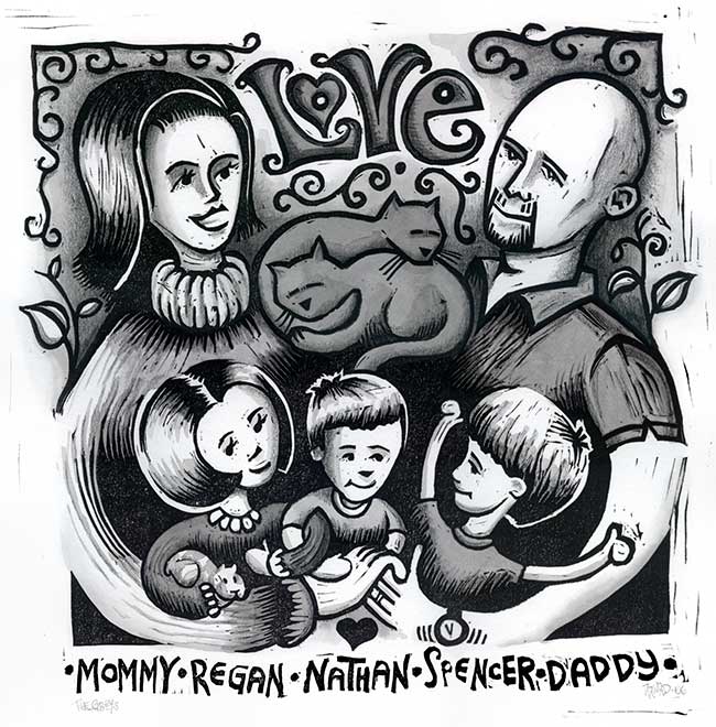
The Greys
This is another oldy-but-goody. This hand-coloured linocut print depicts my sister’s family with their two cats. I did this as a Christmas gift back in 2006. I particularly like how this one feels like a sketch (and Darren’s goatee looks cool too).
Floodstock 13
I’ve worked on the last several Floodstock posters and it’s a project I really look forward to each year.
Geoff and Del give me a lot of freedom to create basically whatever I want. Of course there are constraints and required information but I have a lot of latitude. For this year’s poster, I had the notion to use metallic ink again. The idea of a steel resonator guitar gave me the perfect subject matter to explore.
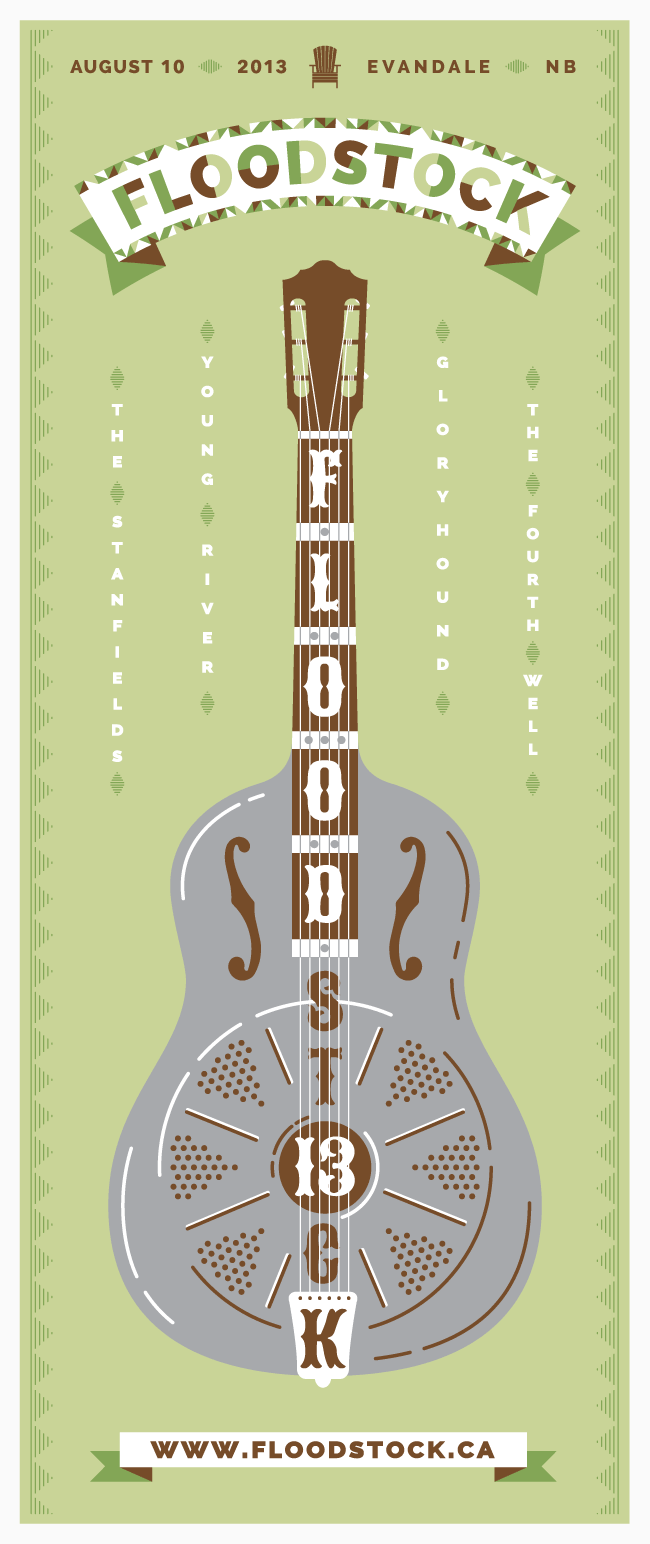
The first line of the title track from Paul Simon’s Graceland was on repeat in my head as I worked on this: “The Mississippi Delta was shining like a National Guitar…”. It evokes such a clear image in my head! Although I knew I wouldn’t be able to re-create the exact effect of a highly polished steel guitar, I thought the metallic ink would provide a unique visual element. I had a pretty clear idea of how this would turn out and I was really excited about it. I actually consider this one of the best Floodstock concepts I’ve had. Which is why it stung a bit more as I realized it wasn’t going to happen. (Just to clarify, I always deliver a digital version of the poster to promote Floodstock ahead of time. The screen printed posters are for sale on the day of the event.)
Where it Went Wrong
Instead of shooting the screens for this year’s poster myself, I thought I’d try outsourcing it. I contacted a local screen printing shop and they said they could clean, coat and shoot the screens for a reasonable fee. Perfect! They had to prioritize their orders before getting to my screens — fair enough — but they were taking a while and I was running out of time to print the posters. Finally they called. I happily picked up my screens and was surprised when they said “no charge!”
I use a high mesh count screen and rigorously check to make sure the small details of the design will reproduce, so I was confident the image would expose well. I started printing but discovered pretty quickly that there were problems with the screens. A good portion of the design on the dark green screen either didn’t get exposed or wasn’t blown out. On top of that, it was quite a bit off when trying to register it against the light green. A closer look at the screen revealed they shot the screen with two pieces of film (not in and of itself a problem, but it simply didn’t register). My heart sank as I realized there wouldn’t be enough time to re-shoot the screens and print them in time.
Another failure: I decided to use a lighter weight paper than I typically do in order to facilitate packing individual posters in tubes, rather than shipping them flat. Unfortunately, the heavy ink coverage on the light green screen caused each poster to curl. This was incidental as I’d already resigned myself to the fact that I couldn’t fulfill the order.
My Bad
I want to be clear that ultimately, I am to blame for this failure. I should have left myself more time to produce the posters and I should have tested the paper stock ahead of time too. It is certainly disheartening to come to the realization that I won’t be able to make good on a promise, but I’ve also become pretty good at letting go of something I have invested a lot of time in. So there’s that.
Hand-printed Posters
In keeping with my “looking back” theme, here’s an old promotional poster I made about 10 (!) years ago. Because relief printing utilizes what’s left of the material in question (usually wood or linoleum) to create the impression, I decided to reverse the typical black-ink-on-white-paper approach. This was mostly due to laziness (less material to carve away for a similar result) but also because I was curious about how light ink on dark paper stock would look. I kinda dig it (and I find the pig slightly rabid looking).


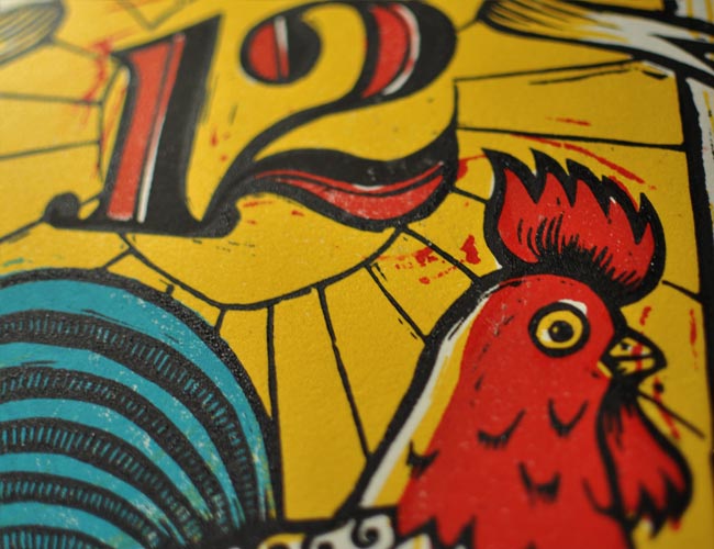
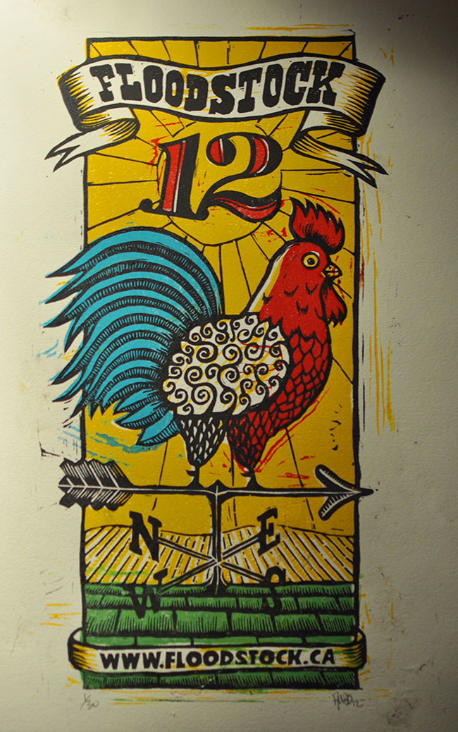
Floodstock 12
This year’s Floodstock poster direction was simple: a rooster. Nothing more to it. The sketches came together well and I started to envision how the colours could work. This five-colour poster was actually printed on three plates. In favour of limiting the number of plates to be carved, I combined the red, blue and green colours on the same plate, adjusting the design to accommodate this approach.
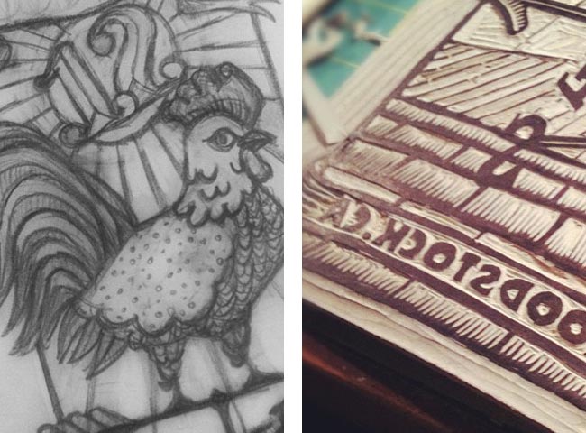
I’ve always taken a fairly haphazard approach to my printing process; I don’t mind slight mis-registration, mottled ink coverage or the odd fingerprint — and since I’m impatient to see the final result, I tend to rush. But my typical approach coupled with a few other factors caused me some frustration on this project. I experimented with a new type of ink: Caligo Safe Wash Relief Ink. It’s an oil-based ink, but it cleans up with water. I like the idea of limiting the amount of Varsol I use for clean up and thought I’d give it a try. Unfortunately, I mis-ordered and had to use my Daniel Smith oil-based inks as well (and to be clear, I don’t think either brand of ink is inferior…they just didn’t seem to print well together for me).
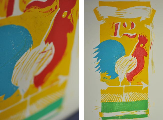
I believe it was the combination several factors that caused me difficulty in getting a good impression: different inks, slightly warped linoleum plates, being in a bit of a rush to finish the posters before the event and a cottage vacation, and possibly the humidity in my basement studio. Lots of wasted prints on this one but the results for the final prints were decent. Certainly some lessons learned for next time!
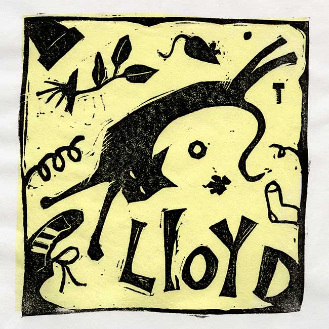
Lloyd
This two-colour linocut was done as a gift for my sister. It depicts her cat who is always getting into some sort of trouble. He once swallowed a lock nut and needed surgery! When they cut him open they discovered he’d already passed the hardware into his intestine so they just sewed him back up (and yes, she was still charged for the surgery).
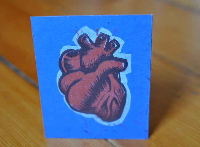
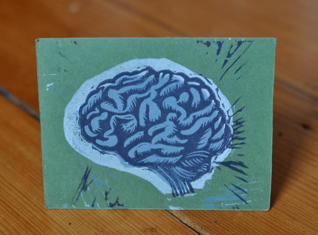
Heart and Brain
These three-colour linocut cards were used as promotional pieces. I’ve always been fairly haphazard when it comes to registering multi-colour prints so I generously ‘trap’ the plates to minimize gaps. I actually don’t mind a certain amount of mis-registration; I think it contributes to the character of each piece. You can get Heart and Brain on a tee shirt too.